challenge
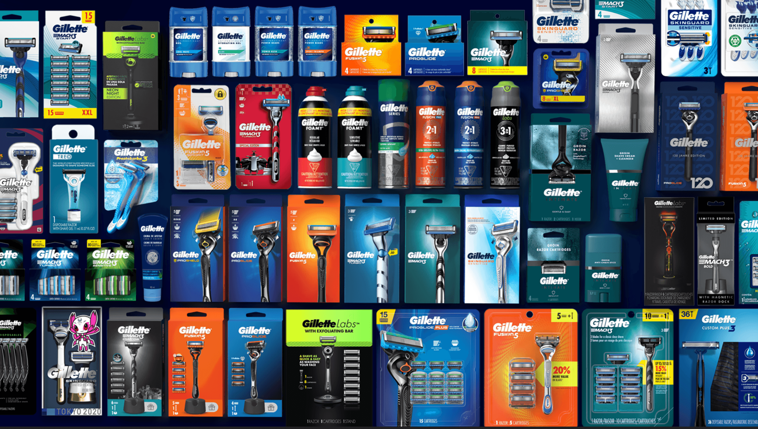
Gillette had spent decades as the dominant force in men's grooming, but the category was fragmenting. Subscription brands like Dollar Shave Club and Harry's were bypassing the retail aisle entirely, competing on convenience and price. Meanwhile, Gillette's own portfolio had expanded into a sprawling range of sub-brands, each with its own visual language, making it harder for shoppers to navigate and harder for the brand to communicate a coherent identity at shelf. The packaging architecture was a legacy of incremental additions over years, not a designed system. The result: a cluttered shelf presence that made Gillette look complicated in a category where competitors were winning by looking simple. The underlying challenge: unify a global portfolio under a single, modern brand architecture that simplifies the shopping experience, sharpens brand expression, and defends Gillette's premium position against leaner competitors.
Client
Gilette P&G
Format
Brand
ACTION
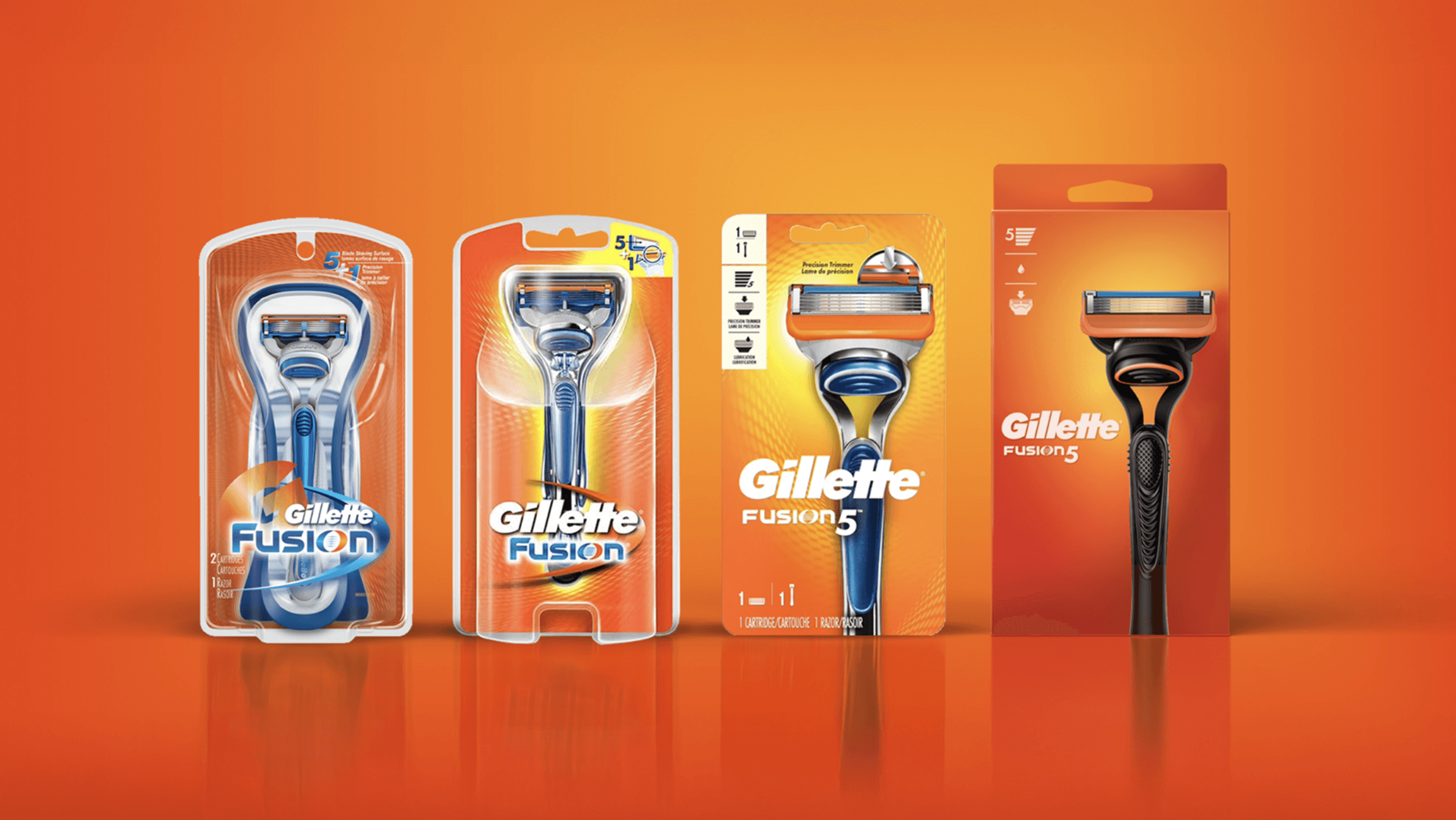
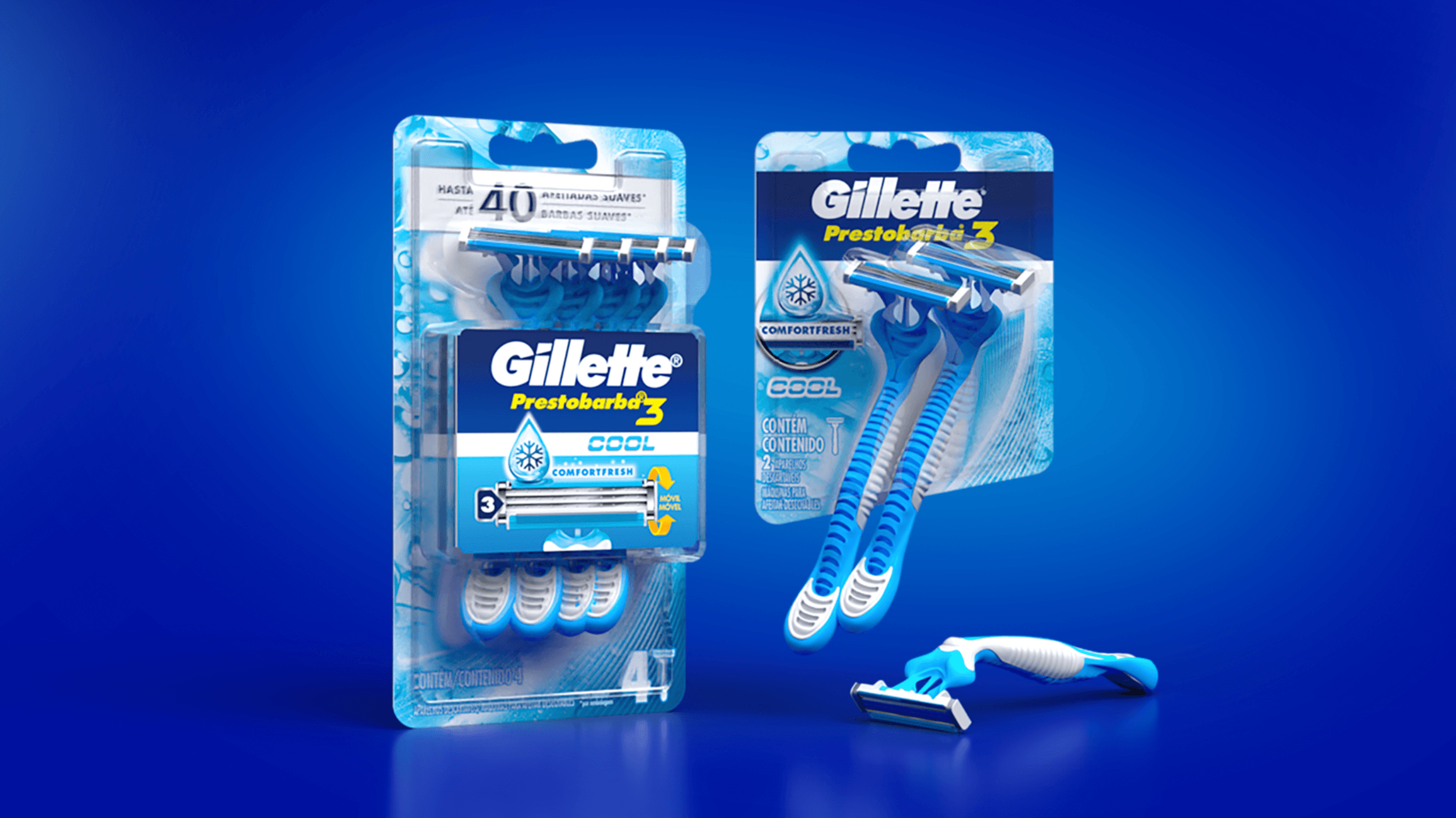
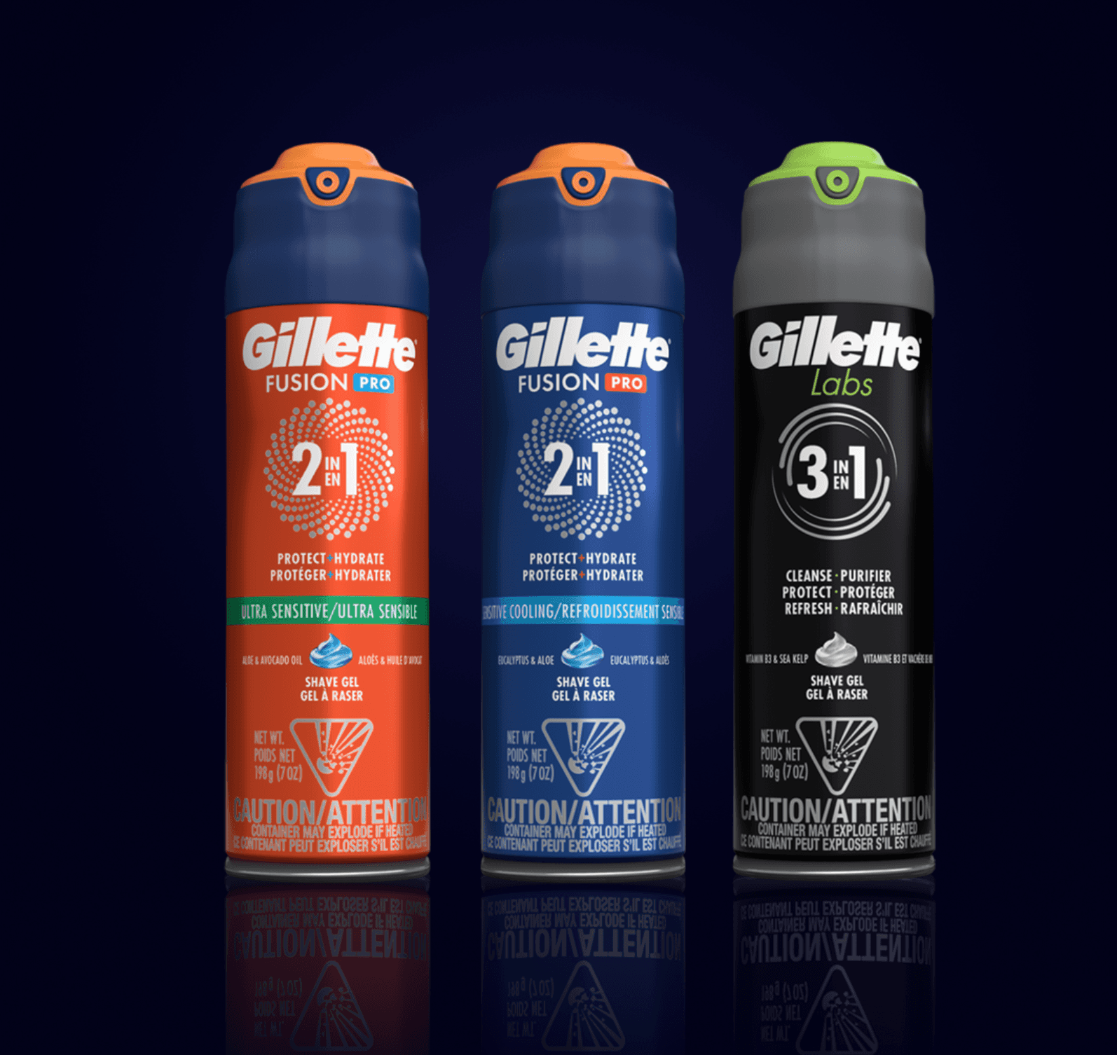
As Executive Creative Director Asia at LPK, I led creative direction on the strategic redesign of Gillette's packaging architecture across the global portfolio. Category and consumer analysis Started with category trend analysis, consumer insights, and retail strategy to understand how shoppers were navigating the aisle, where they were getting lost, and what competitors were doing differently. The research confirmed that Gillette's visual complexity was creating friction, not confidence. Brand architecture and packaging redesign Led the creative development of a unified packaging system that aligned Gillette's sub-brands (ProGlide, Fusion, SkinGuard, Mach3) to a common visual structure. The redesign made room for stronger product imagery, showing off the razor itself rather than burying it behind information hierarchy. The system had to work across price points, across markets, and across retail environments, from mass to premium. Portfolio simplification The architecture wasn't just visual. It was strategic. We restructured how the portfolio communicated to shoppers: clearer tiering, cleaner navigation from entry-level to premium, and consistent brand language that made Gillette's range feel intentional rather than accumulated.
RESULTS
Simplified Gillette's packaging portfolio into a coherent system that improved shoppability across aisles and price points globally. The redesign enhanced shelf presence in a category where visual clarity is a direct competitive advantage against simpler DTC brand packaging. Gillette maintained its position as a global category leader with a $14.5B brand valuation.
LEADERSHIP LENS
This was about making a legacy brand feel modern without losing what made it trusted. Clarity: A portfolio this large can't be redesigned one SKU at a time. The work required a systems-level view, defining rules and principles that every sub-brand could follow while still expressing its own positioning. That's experience architecture applied to physical product. Cadence: Global packaging rollouts don't happen overnight. The system had to be designed for phased implementation across markets, with enough flexibility to accommodate regional requirements without breaking the overall coherence. Care: Gillette's brand equity is enormous, and the temptation with a redesign is to be dramatic. We resisted that. The evolution needed to feel like Gillette growing up, not Gillette starting over. Every design decision was weighed against what shoppers already trusted about the brand.